Art Analysis: Cafe Terrace at Night
A visual and written analysis of Van Gogh's art.
This analysis was originally written and formatted for Twitter. Click the link HERE to read the original Twitter Thread.
Like a fly in the night, my eyes are gravitating to this well-lit cafe.
How does Van Gogh create this intriguing glow in his painting "Cafe Terrace on the Place du Forum, Arles at Night"?
Let's find out:
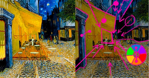
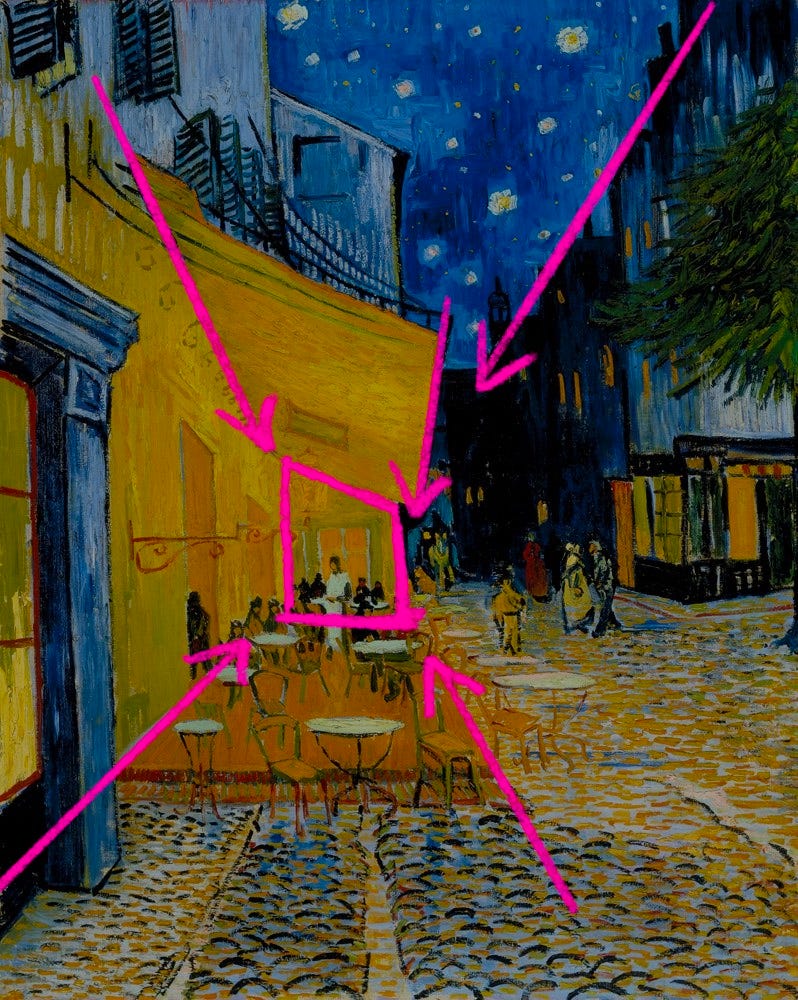
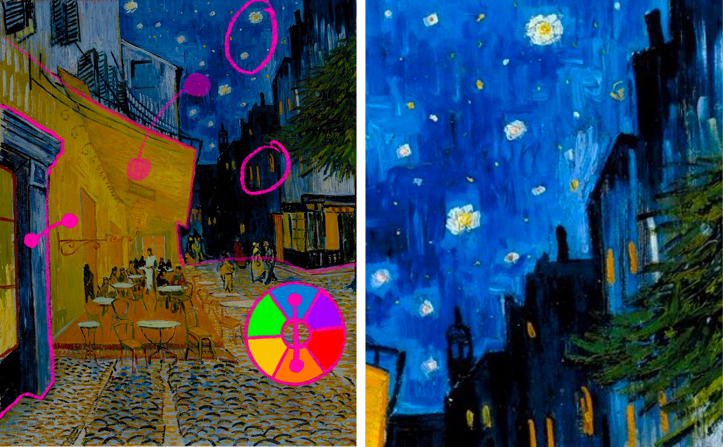
The use of a one-point perspective grid is immediately noticeable. Van Gogh uses the buildings to create these strong perspective lines, guiding our eyes from the corners of the painting to the back wall of the cafe.
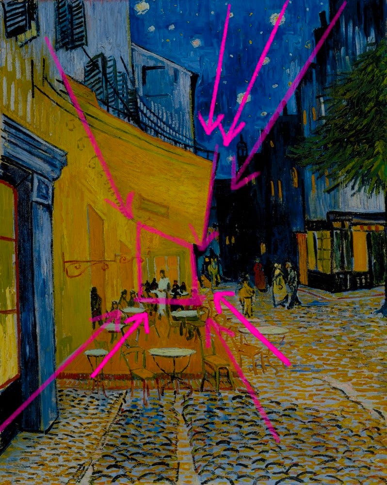
Van Gogh also created imaginary lines with secondary elements in the scene... sneaky!
Look up at the stars 🤩
Also, the seams in the cobblestone streets, the cafe tables, and the windows in the buildings beyond are all strategically placed to guide our eyes back to the cafe.
Van Gogh also uses complementary colors (colors opposite on the color wheel) to separate foreground and background.
The orange cafe in the foreground pops against the blue buildings and night sky in the background, reinforcing the primary perspective grid we saw earlier.
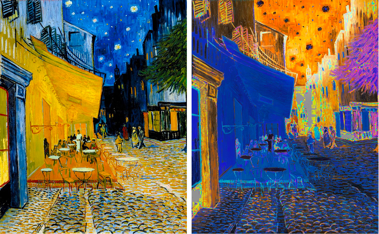
Warm colors (red, orange, yellow) generally appear brighter than cool colors (blue, green, purple). Van Gogh used this to his advantage here.
Imagine if the colors were inverted: a blue cafe with a bright sunset sky. We'd focus on the sky instead of the cafe.
Van Gogh also used complementary colors in the stars and windows in the background, strengthening his perspective lines from 3 tweets up.
The door frame in the foreground is painted blue. Just in case our eyes wander off to the left 👀, he brings us back to the cafe.
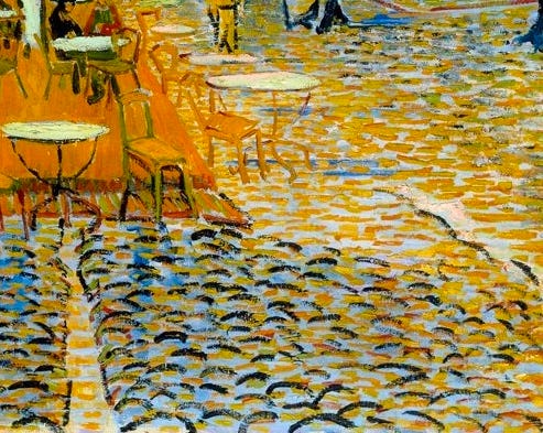
Van Gogh is an impressionist, and impressionists are known for their short expressive brush strokes, which look very abstract if you focus in on them.
He even uses complementary colors in his finest details, expressing the shape and depth of individual cobblestones.
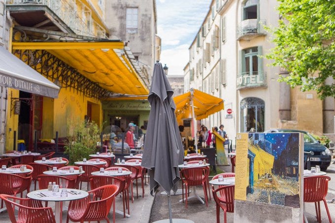
BTW: this cafe still exists. They renovated the outside and changed their name to "Le Cafe Van Gogh" to commemorate this painting and Van Gogh!
After discovering the use of perspective and color theory, I'm not surprised my eyes are fixated on this glowing cafe.
What else do you notice or feel when looking at this painting? Thanks for reading, follow me for visual art analysis threads.


