

Art Analysis: Moet White Star
A visual and written analysis of Alphonse Mucha's poster.

This analysis was originally written and formatted for Twitter. Click the link HERE to read the original Twitter Thread.
How does Mucha capture beauty and fluidity in his lithographs?
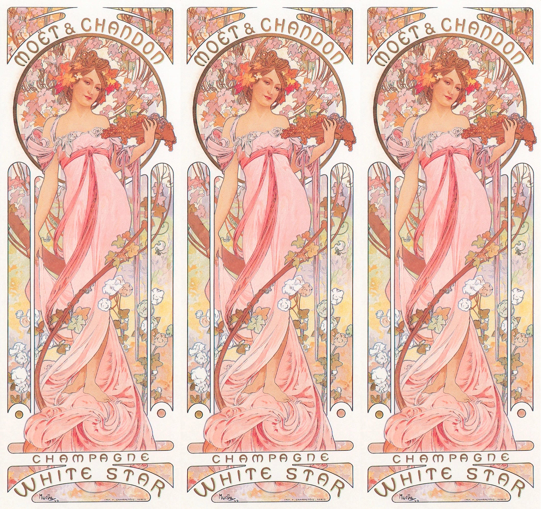
Let's end 2022 with a toast to Mucha's Moet & Chandon posters:
Art Nouveau artists reacted against Renaissance and other historic art styles being taught in academia. They were inspired by nature, focusing on delicate curves and floral motifs.
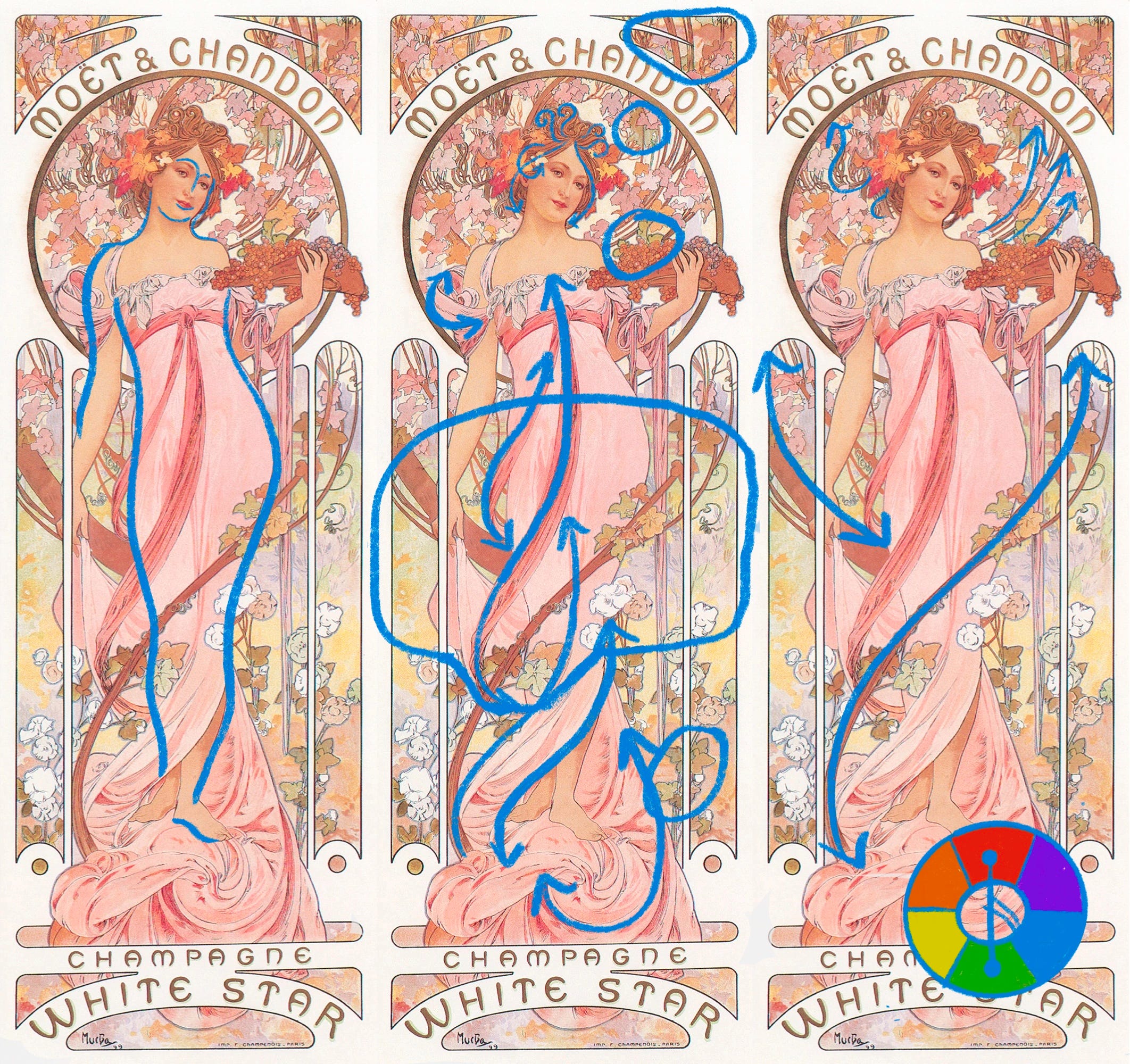
But as an Art Nouveau artist, Mucha beautifully unites Renaissance and Art Nouveau traits:

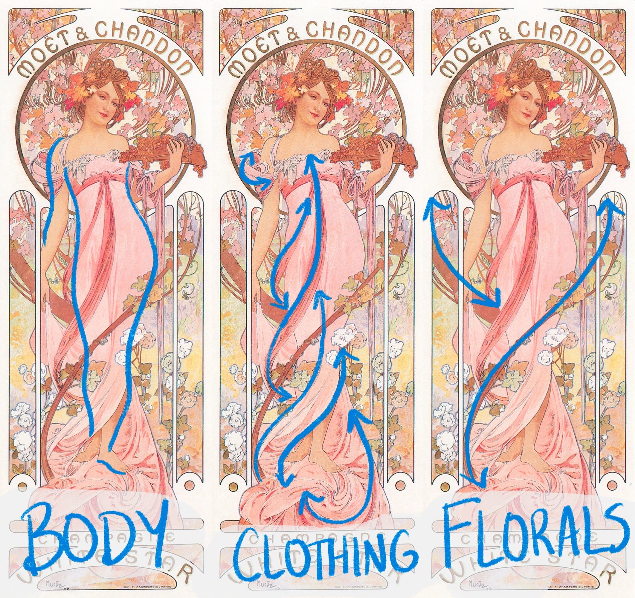
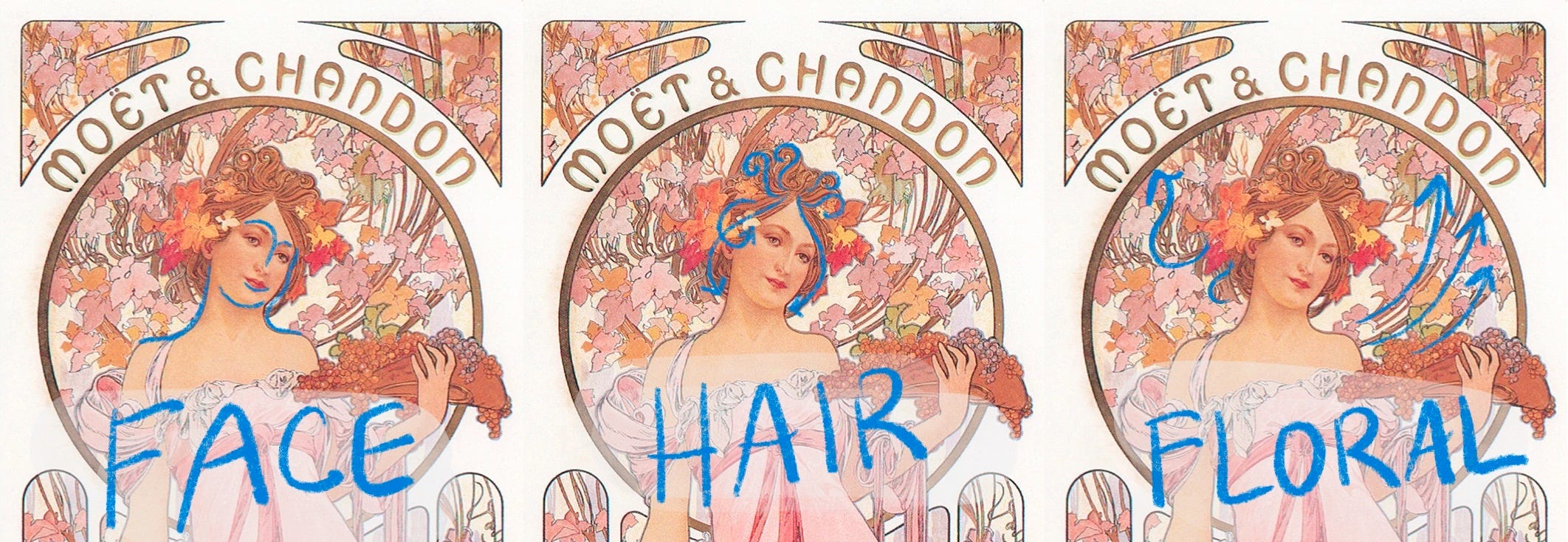
Mucha adds florals on curvy vines and manipulates the drapery of clothing to highlight the beauty in a woman's natural figure....
...and even her face.
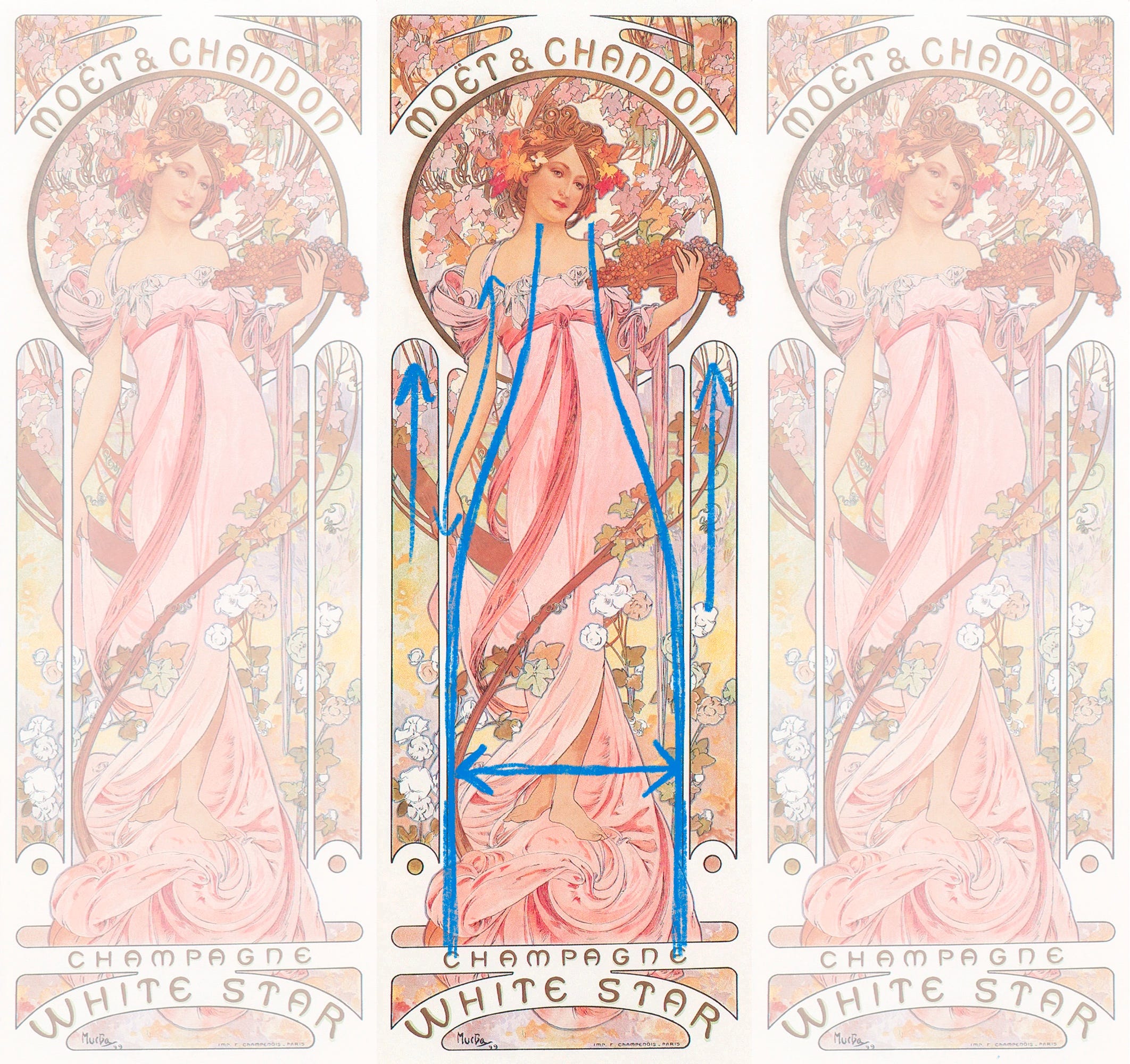
The elegant curves throughout the lithograph and the slender vertical "windows" create an invisible shape: A Champagne Bottle
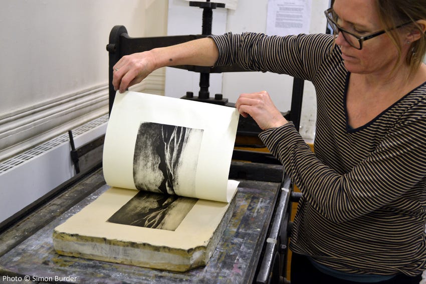
This poster is a colored lithograph.
A lithograph is a printmaking process where an illustration is acid etched into the surface of a stone. Ink gets applied to the etched stone and transferred to paper.
Overlapping layers of inks create the final image of Mucha's poster.
Light colored flowers convey the lightness of the Champagne.
Different shades of pinks complement the woman's peachy skin tone, especially around her face. She appears warm and inviting.

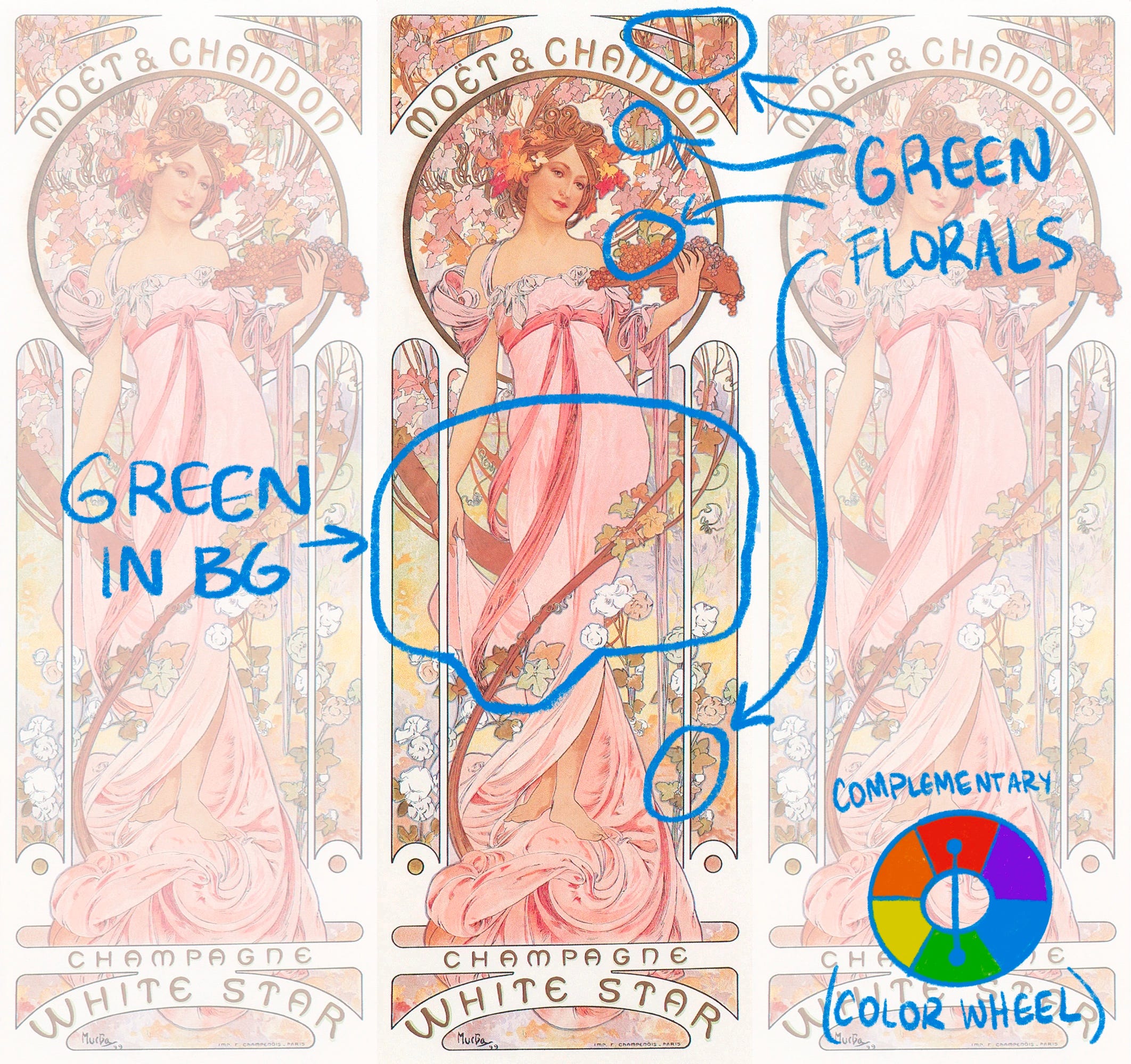
Green is the complementary color of red (opposites on the color wheel).
Touches of pastel greens are used throughout, especially in the background, to make the pink florals pop.
What else do you see in this poster?
Thanks for reading! Follow for more threads like this.
I hope you have a wonderful New Year, Cheers!