Welcome to my newsletter where I share my personal creative process. I hope to inspire you to pick up a pen, paint brush or spatula and create something spectacular.
Here’s this week’s lineup:
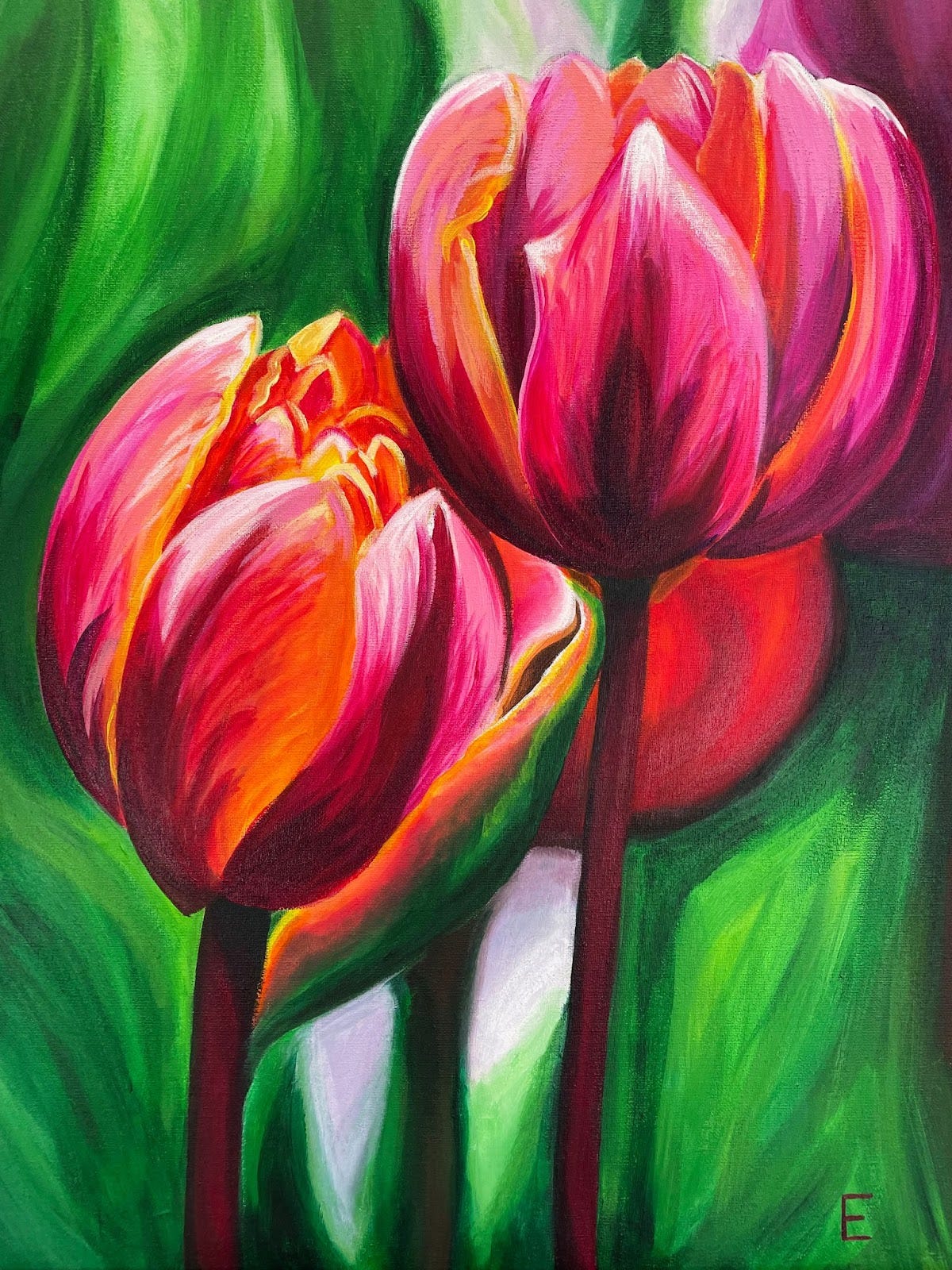
Tulips: A new painting from painting class
Disco Ball 2: My step-by-step process on painting this vibrant lil baby
Temporary Vegan: Super Shake (and fueling the hangry creative beast within)
Tulips
I’ve been taking a painting class with my mom and a bunch of other sweet retired folk. It’s been a lovely and relaxing way to keep myself accountable, while pushing myself out of my comfort zone of realism and into fluidity, impressionism, and “being more free” (as my teacher often reminds me).
This 18x24 inch painting is the second painting I’ve completed in this class. What flower should I paint next?
Disco Ball 2: the Process
This is the second disco ball I’ve attempted to paint, inspired by Not Sorry Art. I wrote about my first disco ball attempt in TDB #9.
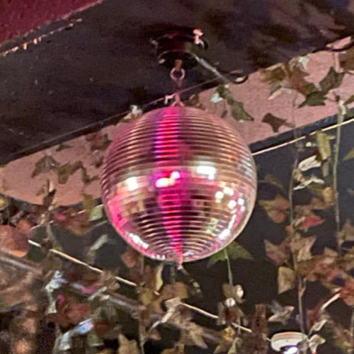
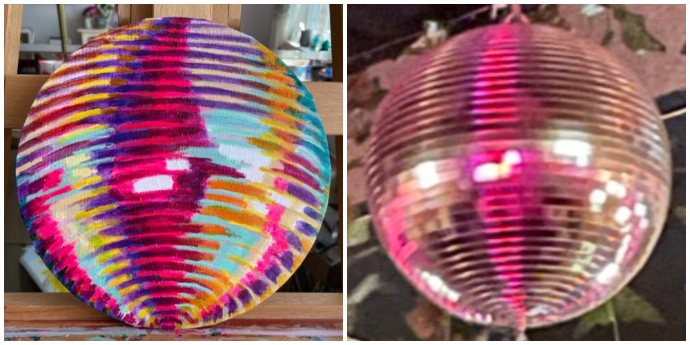
Hiding amongst some fake ivy in a Brooklyn warehouse bar, I discovered this disco ball. Indirectly lit and suspended just above the bar, it was hiding in plain sight. The ball was a wallflower, spinning endlessly in silence. The ball was not lit, but deflecting other sources of light within the room. The minimal, yet colorful light intrigued me. I needed to paint this.
The pink vertical stripe on the disco ball came from a neon light fixture on the opposite wall. I’m not sure where those white spots came from, because the bar was so dark I could barely see my own drink, but they’re perfectly placed.
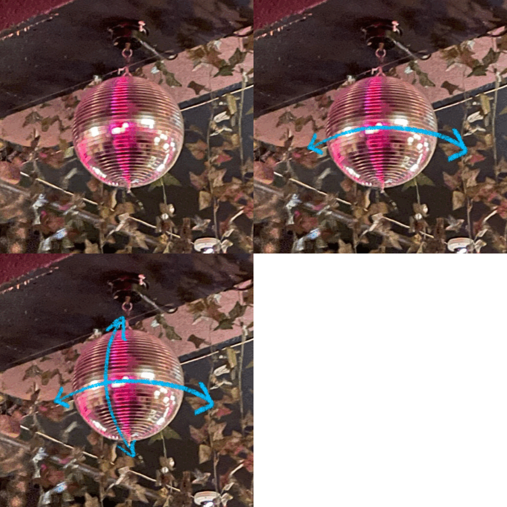
This disco ball loves grids just as much as I do (but not as much as I love gifs). The rows of spinning mirrors create a horizontal grid. The bright white spots divide the ball in half horizontally, while the red/pink stripe divides the ball in half vertically. This grid is key to getting the proportions right in the painting.
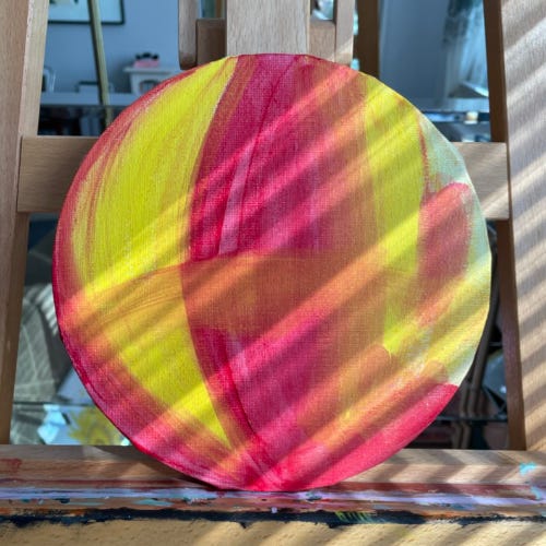
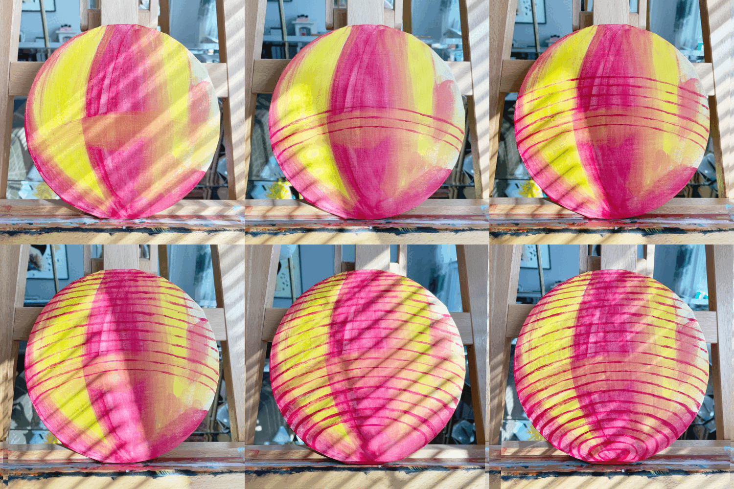
With this grid in mind, I started the painting by identifying and locating the disco ball’s underlying base colors: pink/red and yellow. Yes, there are blues, greens and browns in the disco ball, but pink/red and yellow are this disco ball’s two most dominant colors. They’re the primary colors of the rainbow, as seen in my gif below.
By painting thin layers of these solid pink/red and yellow colors, I created a map on my round canvas for the rest of the painting. I added a quick brushstroke of thin red paint across the center of the ball to give dimension to the flat canvas.
The next step in building this ‘map’ is to paint on the disco ball’s horizontal rows. This is the most difficult task because we’re painting a foreshortened sphere (my explanation of foreshortening in this old Twitter thread).
I looked at each individual seam between the rows of mirrors. Starting from the center of the disco ball, I worked my way up and down, carefully painting each seam to mimic its arc shape and approximate placement.
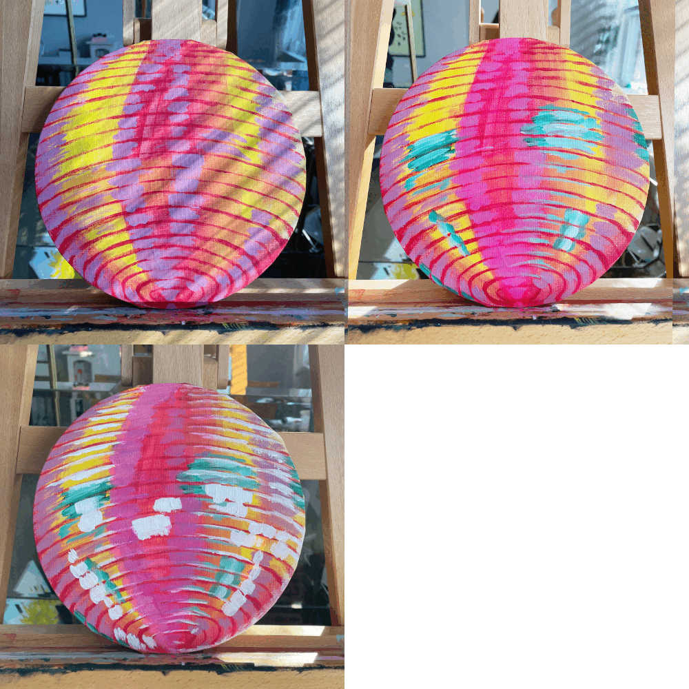
From there I started to add some more color. I focused on the bright purple, green and white areas.
The purple color wasn’t matching the original image. I couldn’t figure out how to make it vibrant. It was frustrating. I tried so many different color combinations, and painted over the purple areas several times. I even tried adding a gloss medium (a shiny gel you mix into the paint) thinking that the added shine would make the neon purple appear more vibrant.
The next day, I noticed the paint dried more saturated than when it was wet, and the purples just became another form of pink. Completely ignoring the problem, I added shadows. But the paint just sat on top of the plastic-y thick glossy paint. It sucked.
The disco ball looked sloppy. My mom thought I painted a foil balloon or paper lantern. I let the painting sit for a few days, but I wasn’t happy with the direction it was going.
Time to start over.
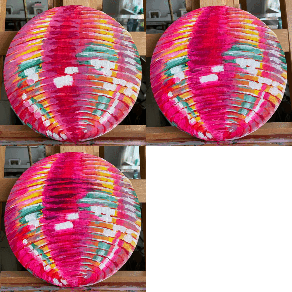
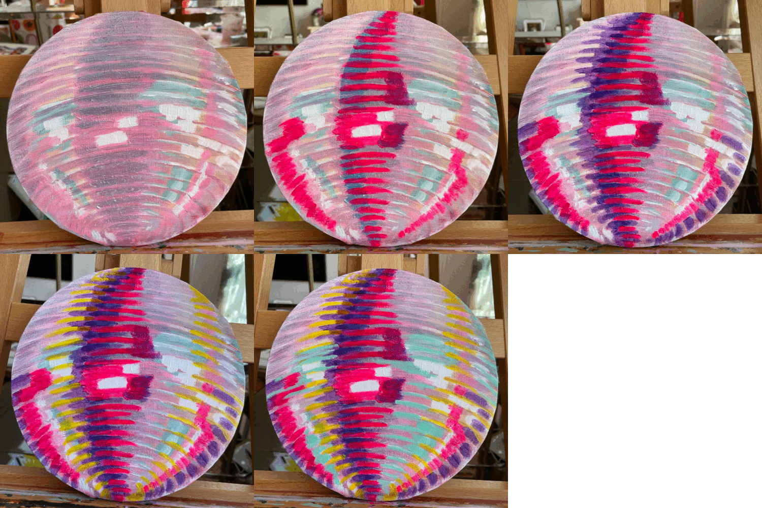
I added a thin layer of white over the entire ball. No going back now.
After I realized I wasn’t going to paint a perfectly realistic disco ball, I decided to be a bit ~ more free ~
To keep it simple, I used paint colors I already had: pink, purple, yellow, turquoise and white.
I loosely placed the 5 colors on the canvas and focused more on creating the illusion of a spherical shape on a flat surface. Like a game of Tetris, I slotted in different stripes of color. Since the paint wasn’t blended, the colors appeared more vibrant.
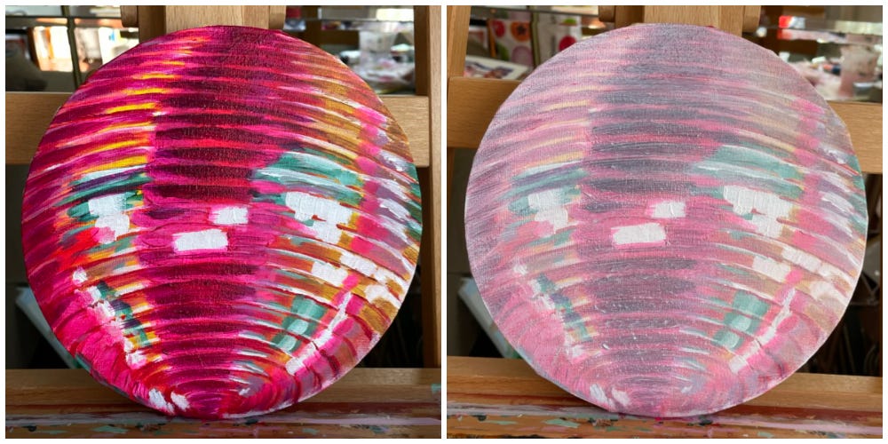
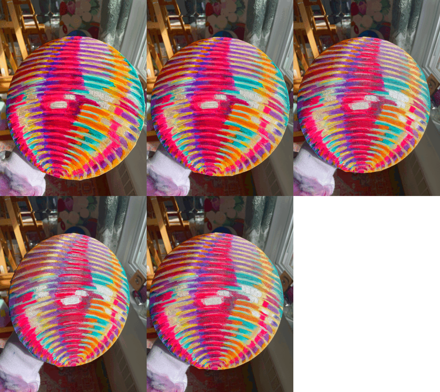
The next day I added shadows. I used darker versions of the colors already on the ball: purple, dark pink, and dark gold.
The process of painting this disco ball has taught me I am still learning how to become a master painter. Making mistakes and starting over is part of the learning process. Every time you start fresh, you are not starting from nothing. Past experiences and mistakes are the foundation for future creative work.
Also, not every painting has to be a perfectly accurate representation of a subject. Choosing to limit the color palette to under 10 colors, and prioritizing expressing the brushstrokes over perfectly blending tons of browns and grays, allowed me to experiment with creating movement. Even though this painting isn’t a realistic representation of my original photo, I’m happy with its vibrancy and color.
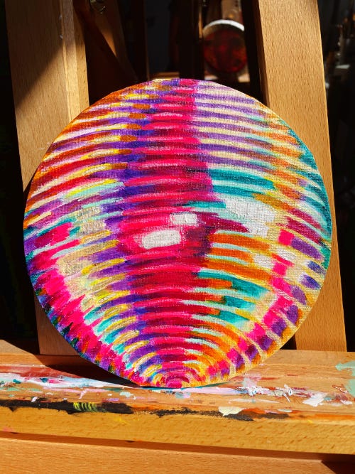
In true Not Sorry Art fashion, I finished this painting with some gold and white glittery paint, and now my painting shimmers beautifully in the sun just like the real deal.
What is your relationship like with making mistakes in your creative process?
How do you feel about starting over?
Temporary Vegan: Super Shake
The Fast has taken a turn. It’s been a struggle. In addition to going vegan until Greek Easter on April 16th, I’ve been trying to eat less portions and cut down my sugar intake.
My body is still adjusting to the change in diet and portion size, and I’ve generally been feeling low in energy with an occasional headache. It’s not only affecting my mood, but also my art and writing. Headaches and naps are my creativity’s achilles heel.
I’ve also broken the Fast several times. Last Friday was pizza night with family, and I inhaled three back-to-back grandma slices. Then yesterday, my mom made fudgy walnut brownies, which I couldn’t resist (in fact, I’m eating one right now).
I needed a little boost to finish up this week’s disco ball painting. Smoothies have been my go to snack/light lunch this past week, so I decided to make one experimenting with the ingredients below.
The inspiration: “Reese’s, but make it healthy.” It actually came out pretty creamy and gave me the energy I needed to power through the disco ball painting. Let me know if you try it out!
Ingredients
1 small ripe banana*
1 packet frozen açaí
2 tbs peanut butter powder (or 1 tbs peanut butter)
1 serving chocolate vegan protein
1 cup oat milk
4 - 5 ice cubes**
Recipe
Add all ingredients to a blender and blend. Enjoy in your favorite tall glass.
*If your bananas become very ripe, with lots of brown spots on the skins, I recommend removing the banana meat from the skins and freezing it. It makes smoothies 10x more creamier and sweeter. You’ll end up with a consistency like a Wendy’s Frostie. But DO NOT add frozen overripe banana slugs, save those for the banana bread.
**Adjust ice cube quantity to desired thickness - more ice cubes will create a thicker texture.
Thanks for reading, see you next time!
Happy Creating, Elizabeth
Special thanks to Sandra Yvonne, E.I.C. for providing valuable feedback on this newsletter, and helping me detach from prescriptive architect-speak.



Love your breakdown of how the disco ball evolved! I'm learning a lot just by absorbing your creative journey. And where's the glitter that the people demanded?
Also, the tulips are gorgeous!
I love your disco ball so much ✨ You are inspiring my evolving dream bachelorette party aesthetic, which is currently celestial babes meets disco glam 🤣 Your art makes me happy & look forward to each edition of TDB!