Welcome to my newsletter where I share my personal creative process. I hope to inspire you to pick up a pen, paint brush or spatula and create something spectacular.
Painting my Dog’s Tongue
It was the first day of fool’s summer, and the air was hot under the beating sun. I went for a walk through winding tree-lined paths with my dog Bode (“Boh-dee”) in the park close to home.
He was tired and overheated. While panting like crazy, Bode let his tongue drop through a wide open grin. It’s the sign he’s having a good time. His tongue flapped around while we walked. Eventually, we sat down at the park bench where I snapped this picture to capture this moment of pure bliss:
This face makes my heart melt. Bode just turned 10 years old, and he’s starting to show signs of aging through his still-infinite-puppy-like energy. I wanted to honor his life by painting a large portrait of him (20x24 inches, or a B2 page size for my metric friends).
I already painted a realistic portrait of him. It looks like something you would see at Buckingham Palace. He likes to pose for the camera, showing off his regal side. He’ll often cross his front legs too, if he’s laying down.

This painting doesn’t capture Bode’s personality; it captures the essence of what everyone expects a doberman pinscher to be: stoic.
Bode can be serious (if not scary) sometimes, but he’s mostly dopey and completely unaware of his size. He sprints around the house, knocking into tables, fueled by an infinite supply of puppy-like energy. Then suddenly stops, turns his head around, and looks at me with big crazy eyes. A huge grin will stretch across his face before he keeps on running.
To capture Bode’s colorful nature, I turned to artist Lily-Rose Burgess for inspiration. I discovered her art in a #oilpainting Instagram-Reel-hole. She posts tons of short videos, showcasing her process of painting rainbow-like still lifes from start to finish. She uses bright colors and expressive brush strokes to bring life to mundane everyday objects - like this spray bottle filled with glass cleaner AND a sponge.

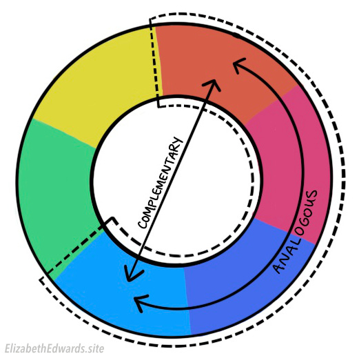
After watching this video repeat 10 times, I noticed how she uses color theory to achieve color harmony in this painting. She starts with a solid layer of purple across the whole canvas. This move makes the blue cleaning bottle and pink sponge feel harmonious together, because blue, purple, and pink are analogous colors. Her primary background color, yellow, pops against the purple background because yellow is complementary to purple.
Lily-Rose could’ve just painted the cleaning bottle and sponge on a white surface. But instead, she exaggerated the colors, making cleaning products look appealing with her vibrant yellows, pinks, blues and purples.
I wanted to integrate Lily-Rose’s technique into my new Bode painting.
First, I decided to exaggerate Bode’s light brown patches of fur and paint them orange. So I began the painting with a solid layer of light phthalo blue, a color that compliments orange. In true Lily-Rose fashion, I sketched the outline of Bode’s face with orange paint as well.
Black and white fur is boring. Instead, I chose to paint the black fur in shades of purple and blue. These colors were perfect because they’re analogous to his bright pink tongue. With “be more free” in mind, I painted all of Bode’s details with big, expressive brushstrokes, matching the direction of his fur.
I couldn’t resist painting Bode’s eyes with a little more resolution. His eyes communicate ALL of his emotions - I usually know what he’s thinking, whether he’s hyped up for a walk, or anxiously waiting to eat some chicken. Our bond is strong because we stare into each other’s eyes whenever we’re together. He’s not just another family dog, he’s one of my best friends. His eyes need to convey that.
But don’t worry, the tongue is still the star.
There’s some work left to do on this piece, like adding more detail to his tongue and collar.
I’d love your thoughts on the background. I originally wanted to paint the park pond, with some native turtles and trees. But I’ve also been told by several people that keeping the simple solid blue background would allow Bode to stand out more.
Reviving Magical Interiors
It’s the last week of Write of Passage Cohort 10, and I’m exhausted. Giving feedback on over 50 essays stretched my brain in ways I didn’t know were possible. I’m looking forward to decompressing for a week, and preparing for my transition back into working as an architect.
The final assignment was to curate the work of an online creator you think others should know about. Last cohort, I curated the work of Kelly Wearstler. She’s an eccentric interior design magician with a luxurious portfolio.
In this piece, I share some of her basic design tricks so that you can make your home feel boujee too.
“I walk into the Austin Proper and it's as if I'm teleported to an old-fashioned Southern tea party. A whisper of “Woah” escapes me. The walls are gardens, with roses and wildflowers nestled in lush greenery. I’m delighted by mis-matched chairs, all round with soft pink fabrics. Cartoon spider legs support the polished pink marble tables. I sink into the gold velvet sofa and face the bar. I’m curiously invigorated while at ease. Two bronze birds perched on a bowl overflowing with limes…”
Thanks for reading! See you next week.
Happy Creating, Elizabeth 🎨


I love a good ol' Liz breakdown. You make me color theory literate and I can't thank you enough. I'm really glad that you chose to give his eyes more detail–it was the part of the piece that I stared at the longest.
Bode looks like such a happy boi :) That glimmer in his eye warms my heart and I love how he pops against the blue.
Hope you have a great first week at work, Elizabeth!