Welcome to my newsletter where I share my personal creative process. I hope to inspire you to pick up a pen, paint brush or spatula and create something spectacular.
Fluorescent Frustrations
I’ve been inspired lately by Silver Francis and her “fluid impressionism” style of painting. With vibrant colors and long graceful lines, each brush stroke is like a standalone expression. She’s a master of color and lighting her subjects. (FN: the “what” of an artwork. Includes individual objects, people, groups of objects and people, natural elements like a tree or mountain, or a whole scene of a landscape, cityscape, etc.)
Silver Francis has a huge collection of skull and bone paintings. Fascinated with nature, she brings life into elements associated with death and illuminates them with a whole spectrum of saturated colors.


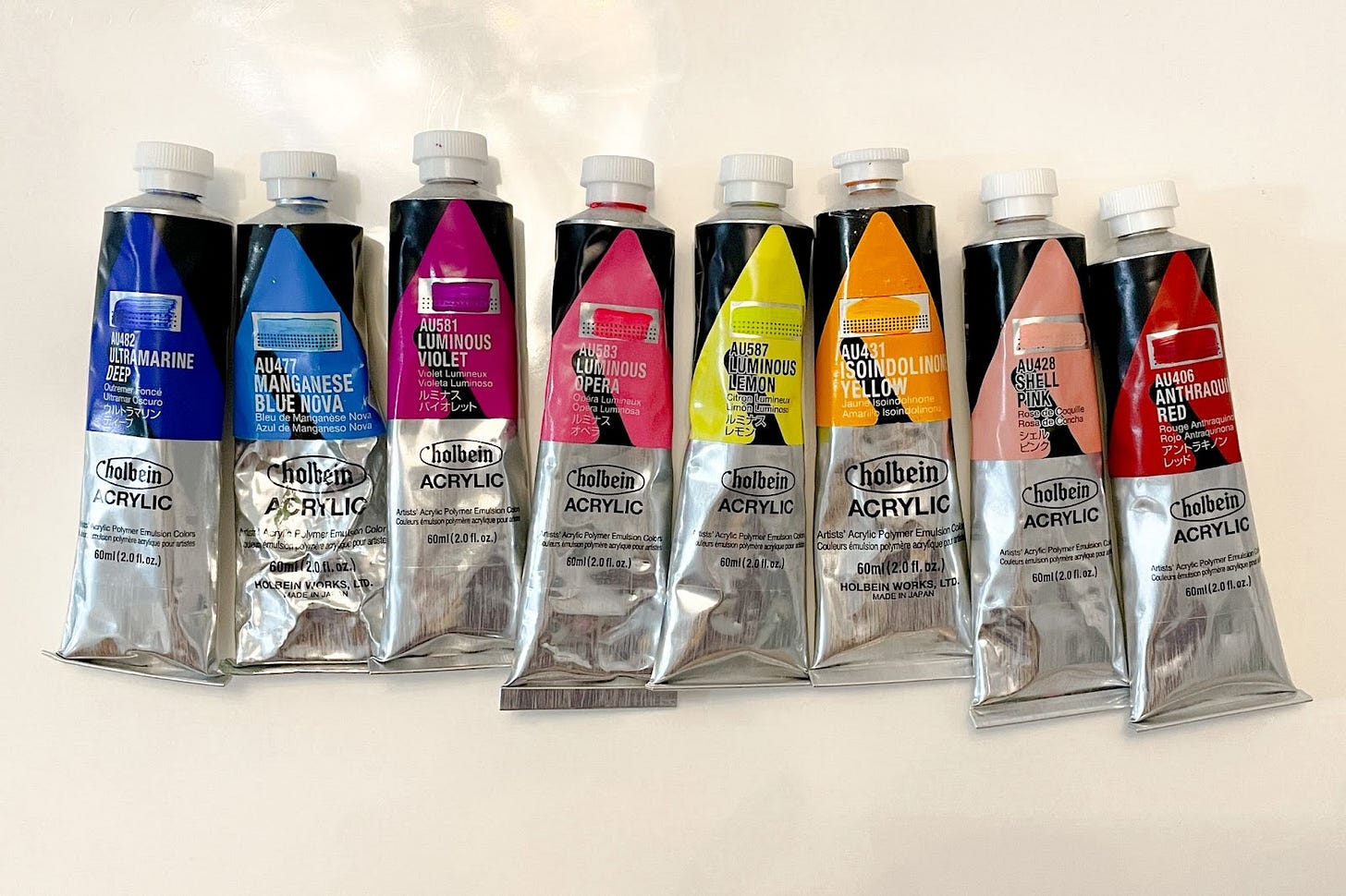
I decided to attempt her style in art class this week and use a few of the luminous Holbein-brand paints I recently splurged on. My plan was to paint an X-ray of my mom’s knee replacement in the Silver Francis’ style, with Lisa Frank colors.
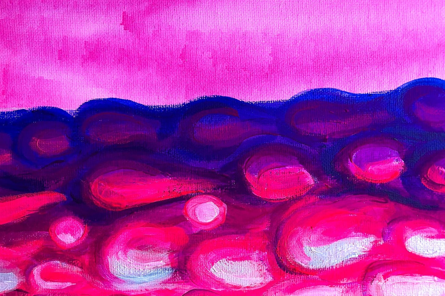
Like what happened with my previous disco ball painting, the luminous colors were not appearing as vibrant as I’d hoped. Although these paints are thick and heavy bodied, the luminescent colors were sheer when applied to the canvas. I tried mixing them with Titanium White paint to create light and opaque shades, so I could add light tones on top of darker tones. But the resulting color was a dull and murky mess.
Unfortunately, I will not be sharing progress pictures of this catastrophe with you.
When I ran to my teacher, panicking, asking for advice, she suggested I turn the painting into a tree. Apparently in the art world, the form of the human body and a tree are interchangeable.
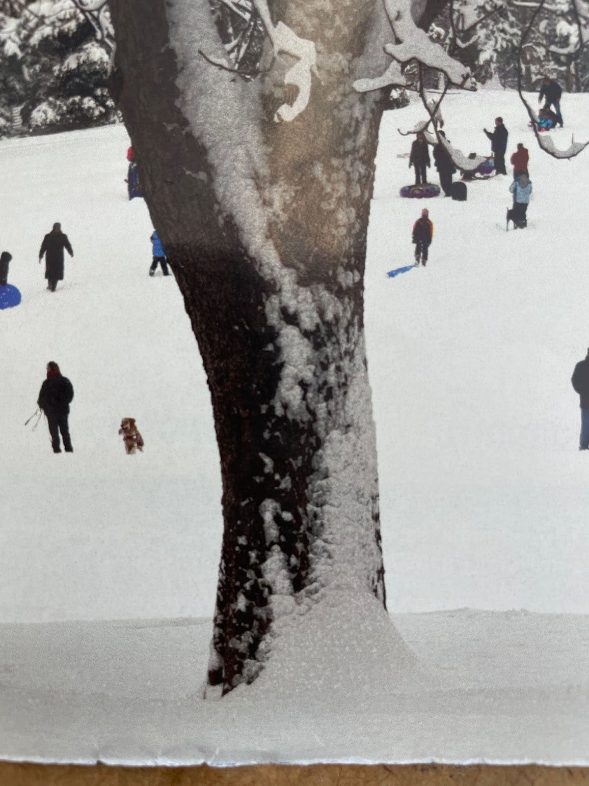
She pulled out a grainy, zoomed-out photo of a wintery snow scene with families and dogs sledding down a hill. There was a large snow covered tree in the center of the scene.
At first I hesitated, and thought this is too easy. But I was wrong. Figuring out how to create the depth of a cylindrical tree with natural, uneven bark on a flat surface with luminescent paint was a challenge. How do I make light areas pop when ALL my paint colors pop?
Again, I tried mixing the luminous colors with white and they lost all saturation. Even the plain white paint, which is obviously the lightest color, looked dull compared to the luminous ones.
It was also difficult to see the detail of the tree bark from this photo. And my attempt at painting the bark in Silver Francis’s fluid impressionism style ended up looking like blobby growths. It looks like the tree is melting, which isn’t necessarily a bad thing. But one of the older ladies in the class asked me what I was smoking.

Actually, this reminds me of my friend’s birthday party in SoHo around five years ago. I was hanging out with a group of triplets at the bar and one of them was a professional fine artist. She told me to NEVER use luminous paints. It was mostly because they fade over time. She also told me to paint with gloves, because some of these pigments are toxic. Oops!
This whole process taught me that I still have a lot to learn about color theory. I need to experiment more with with the luminescent paints, and discover how to incorporate them with normal, non-luminescent paints.
Temporary Vegan: Godfather Edition
My husband’s Godfather is coming over for dinner tomorrow, and he is also observing the Fast. I’m excited to host him. This will be the first time I’m preparing a three-course vegan dinner for guests.
Thankfully, he chose Thai, my favorite cuisine, the one I’m most familiar with cooking. The most important thing when preparing this menu was to choose recipes that had similar ingredients between different courses. This way, several dishes and sauces can be prepared at the same time, which makes multi-tasking very possible.
Here’s the menu. Let me know if you try any of these:
First Course
This Thai Salad
Main Course
Killer Tofu from TDB #10, Marinated Peanut Tempeh (a new recipe I’m excited to try), sauteed veggies and rice
Dessert
Vanilla Oatmilk Ice Cream and Mango Sorbet
Thanks for reading, see you next time!
Happy Creating, Elizabeth


I had to zoom in on Silver Francis’s painting because THOSE DETAILS. Like inside the eyeballs. Her brushstrokes and blending is magic and so delicately done. "Fluid Impressionism" is such a perfect name for her style. Also, so much blue and green in nearly all of her paintings too!! Except the “Passing Pink” skull, which is probably my least favorite because it looks so...metallic? I like that tie in of those cool colors with the theme of death/nature/life. Here for this psychedelic death/skull energy. Also umm love the specificity of wanting to use “Lisa Frank” colors. Drawing skulls is fun, but I've never tried painting them 👀
Kinda stunned that tree picture was what you were using to reference because it looks fake??? And to me, it looks…flat?? How you managed to paint what you did is a miracle.
Thank you for making it clear that’s not your mom’s knee turned into newsletter content lolol
Now drop the recipe for the Vanilla Oatmilk Ice Cream and Mango Sorbet????????
Take Photos of The Thai!!!