Welcome to my newsletter where I share my personal creative process. I hope to inspire you to pick up a pen, paint brush or spatula and create something spectacular.
Sunflower: Completed
In the previous issue of TDB, I wrote about my painting process for this Sunflower.

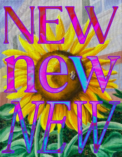
Last week, I completed the sunflower in my painting class. Most of the class was spent refining these details:
In the background, I toned down the color of the house’s bricks with a more muted color: a mix of parchment and red oxide colored paints.
In the foreground, I added texture and dimension to the leaves by painting layers of dramatic highlights and shadows.
For the sunflower, I created the illusion that its head casts a shadow on the petals by shading them with an orange-y yellow paint color (isoindolinone yellow).
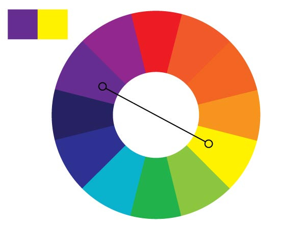
The little bee was my favorite subject to paint. I chose to paint the black parts of the bee with dark purple. Since purple is yellow’s complementary color1, the bee really pops in the foreground against the petals.
Using the smallest brush I had, with a fine tip like a pen, I swirled layers of parchment and dark purple to capture the veining in the wings. And I couldn’t forget the yellow fuzzies on its head. Painting a subtle shadow on the bottom gave the bee a three-dimensional flare, as if its popping off the canvas.
I’m really happy with how this painting turned out. It's so easy (maybe even TOO easy) to give up on something in its early stages because it’s not what you envisioned yet.
I started this painting over two months ago. In an attempt to be prolific, I set an impossibly high expectation: complete a hyper-realistic painting (matching the photo) in ONE day.
An hour in, I gave up. I crushed myself. I convinced myself I was a terrible artist, an amateur who could never create masterpieces, completely forgetting I painted Casper.
A few weeks ago, I decided to give this painting another chance. The time away gave me space from that negative mindset. With fresh eyes, and the support of my art teacher, I felt motivated to breathe new life into my painting. Only by attempting to work through it a second time, I realized that realism didn’t feel right for this painting anymore. I felt a sort of relief when I decided to change direction and attempt some surreal impressionism.
Whether it’s a painting, an essay, a newsletter… whatever it is that you’re doing, the key to creating anything great is to stick with it.
Push through the ugly. Ditch your high expectations. You’ll never know what’s possible for your creative work if you don’t finish.
Thanks for reading, see you next time!
Happy Creating, Elizabeth


Beautiful sunflowers, E! You’ve painted joy in full bloom 🌻
They make me think of summertime, honey sweetened iced tea, and picnicking with friends 💛
Ohhh the bee and the sunflower! Love how it turned out, and OMG the details are astounding! And no you are NOT a terrible artist -- this essay is the sheer proof of the contrary!